CPRBuddy
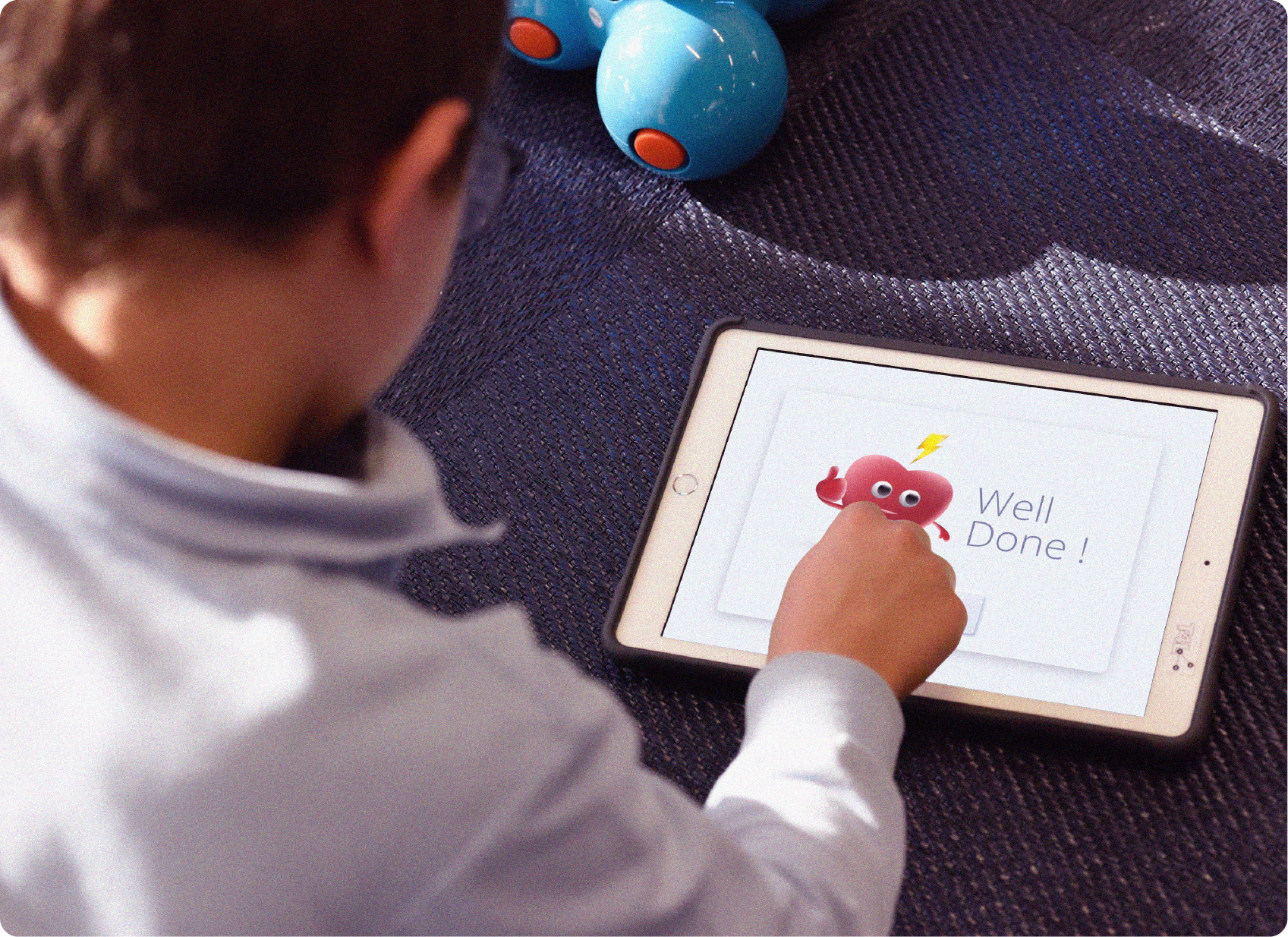
CPRBuddy is an iPad application for helping kids learn CPR. It has two different views for students and trainers, and allows the trainers to monitor sessions, gain insights, and improve training every time. CPRBuddy teaches kids to administer CPR independently with minimal guidance from the trainer.
My Role
I was responsible for UX, visual, UI design, motion design, the design system, and building the case study.
Team
Robins Mathew
Subha Nair
Case Study Video
Design Brief
The mission was to design an application to teach kids between the ages of 10 and 13 the essential skill of CPR. CPRBuddy is an iPad application that takes on this challenge, combining playful learning techniques with crucial life-saving knowledge.
It also provides trainers with insights to enhance the training experience continuously. The ultimate goal? To empower kids to perform CPR with minimal guidance and improve bystander CPR rates, one training session at a time.
The aim was to design an application that could teach kids aged 10 to 13 years, the essential skill of CPR. CPRBuddy is an iPad application that takes on this challenge, combining playful learning techniques with crucial life-saving knowledge. It also provides trainers with insights to continuously enhance the training experience. The ultimate goal? Empower kids to perform CPR with minimal guidance and improve bystander CPR rates, one training session at a time.
Who is it designed for ?
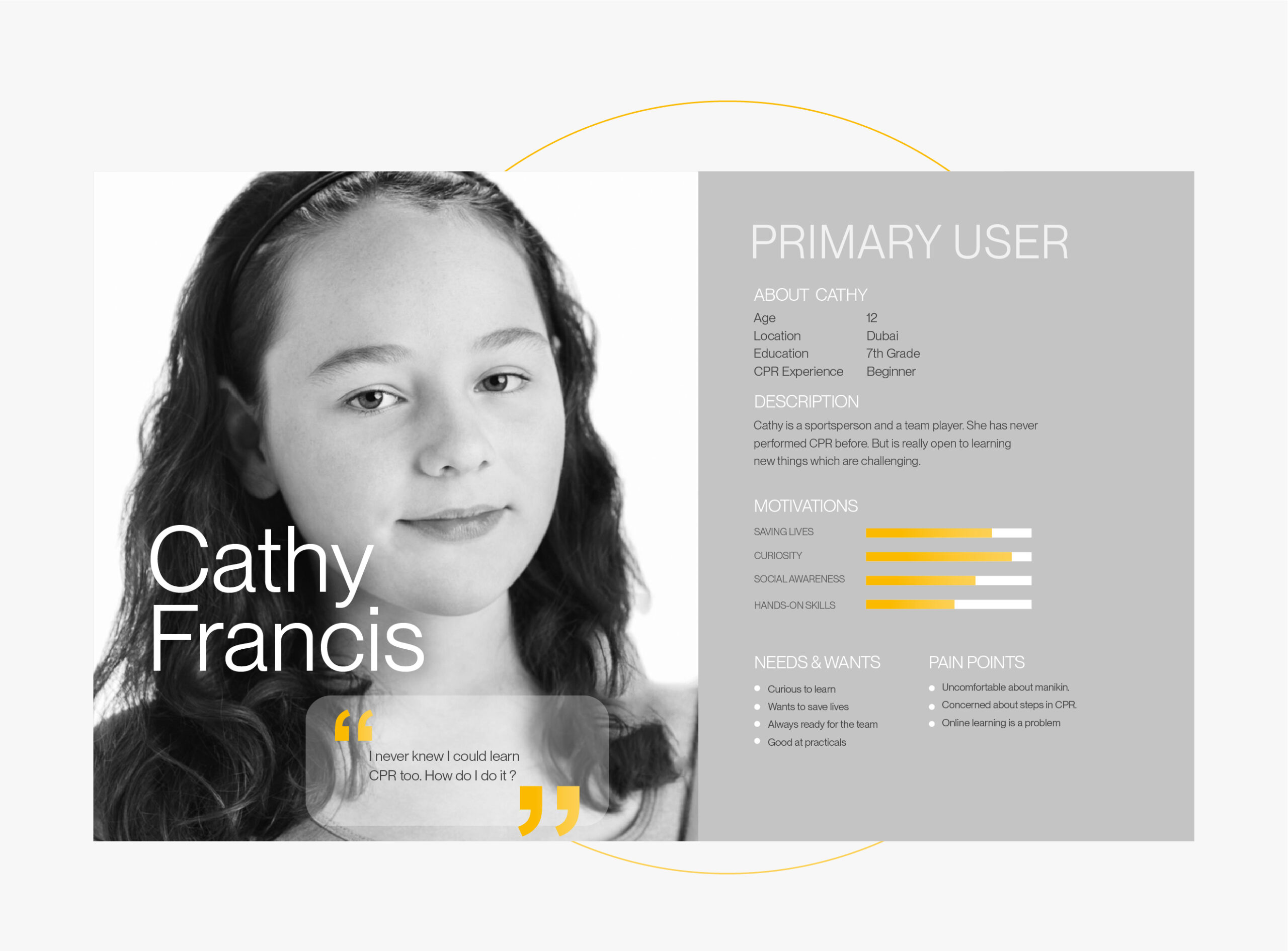
CPRBuddy’s primary target persona are kids aged 10–13, at a stage where they are most receptive to new skills.
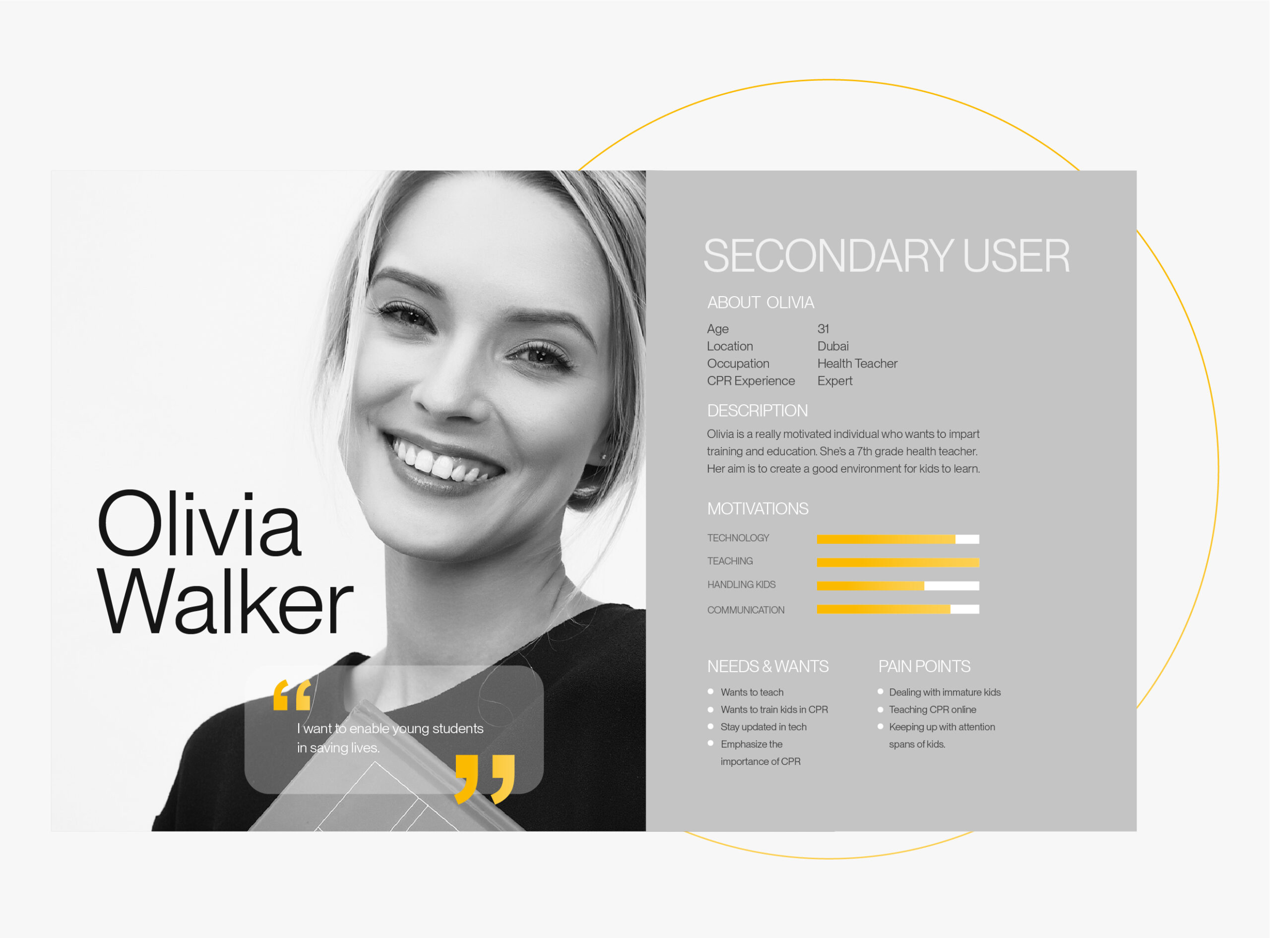
The trainers are educators who regularly practice CPR and have a wealth of experience under their belts.
We used the stanford design thinking process as a framework to build our concept
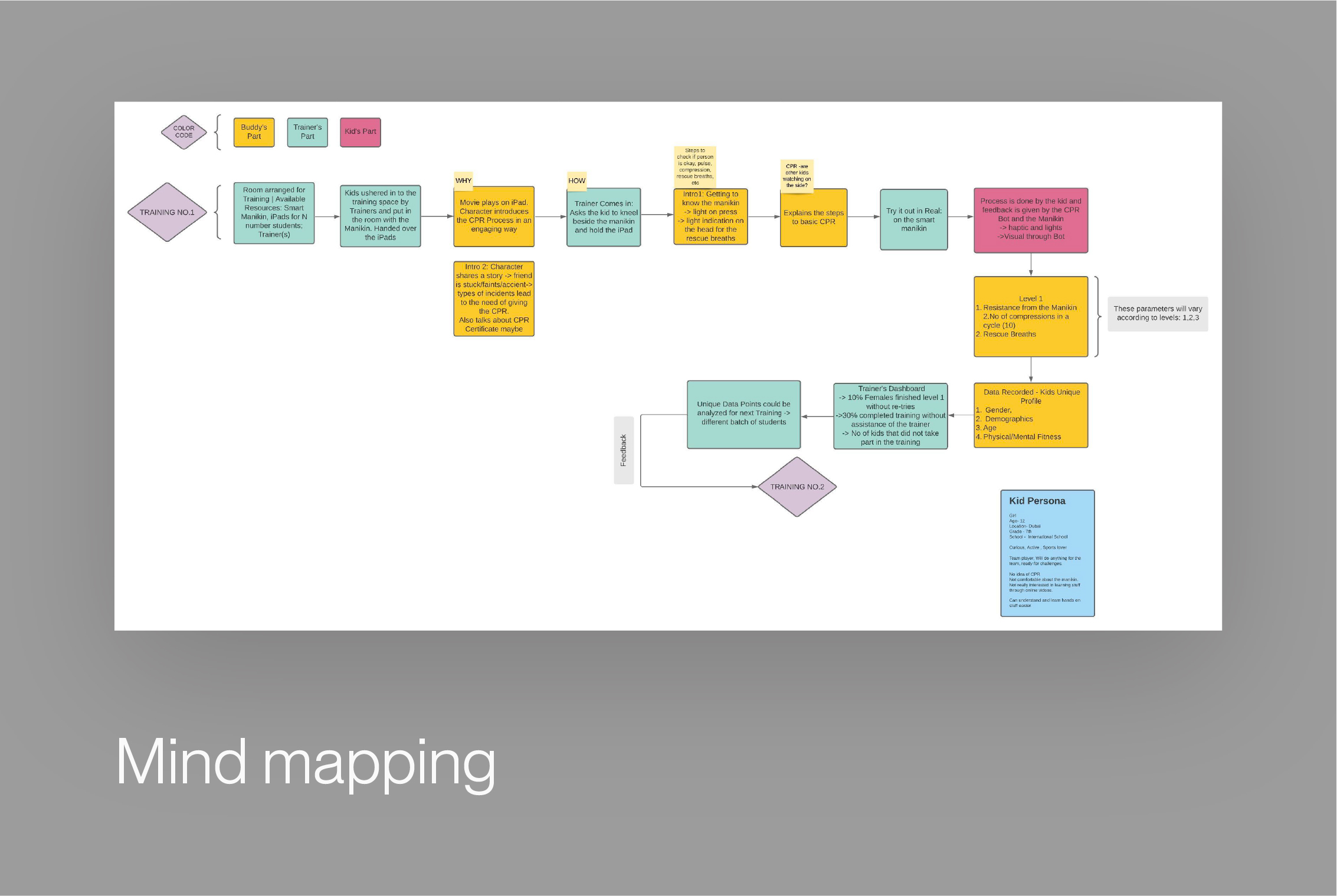
To understand the training's effectiveness, we delved into how to holistically design the course with each step complementing the next.
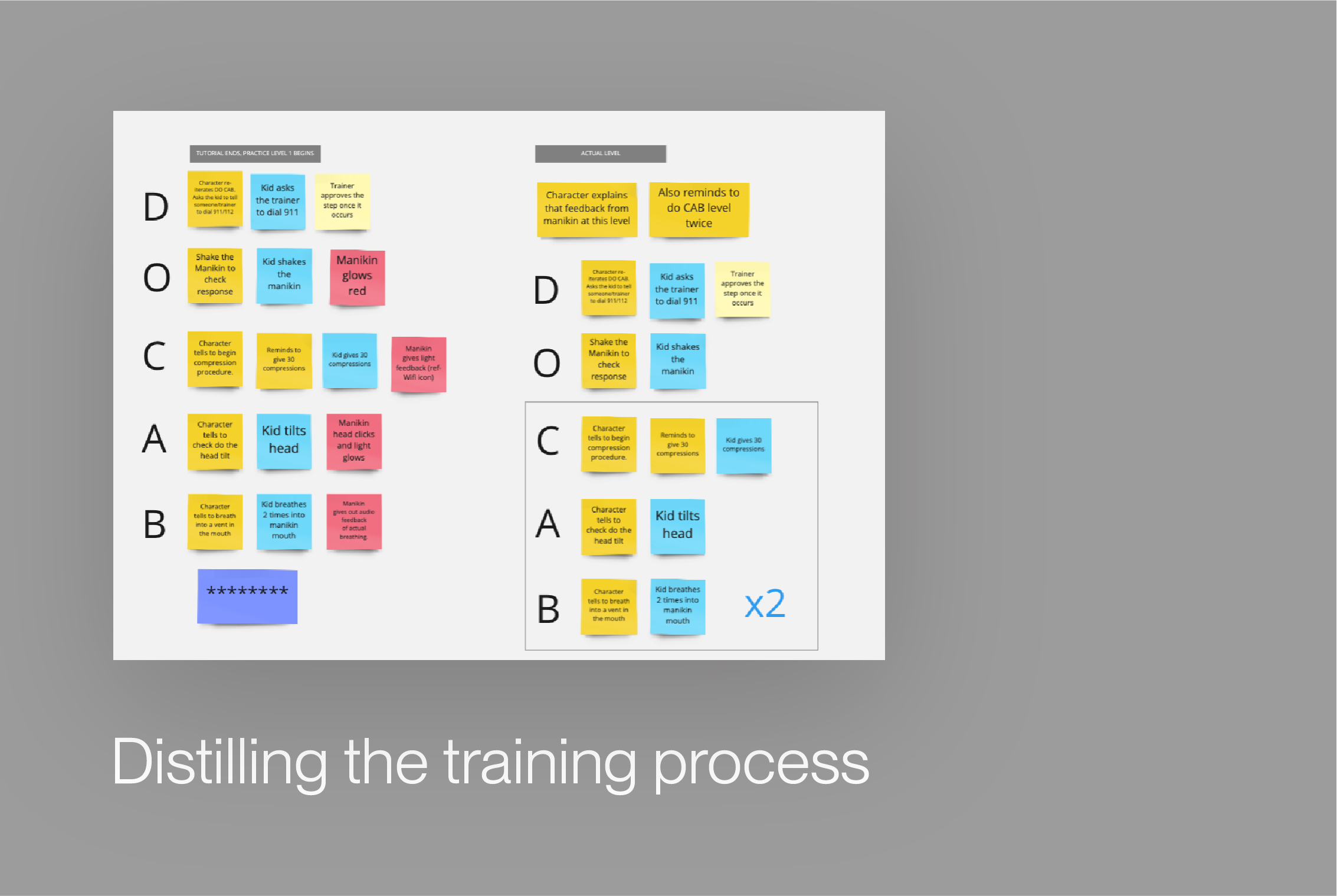
We started with a mind-map of all the steps a kid might encounter during the training, distilling the entire process.
We introduced the acronym DOCAB - Dial 911, Observe for response, Give Compressions, Check Airway, and Give Breath - to break down the training into easily digestible steps.
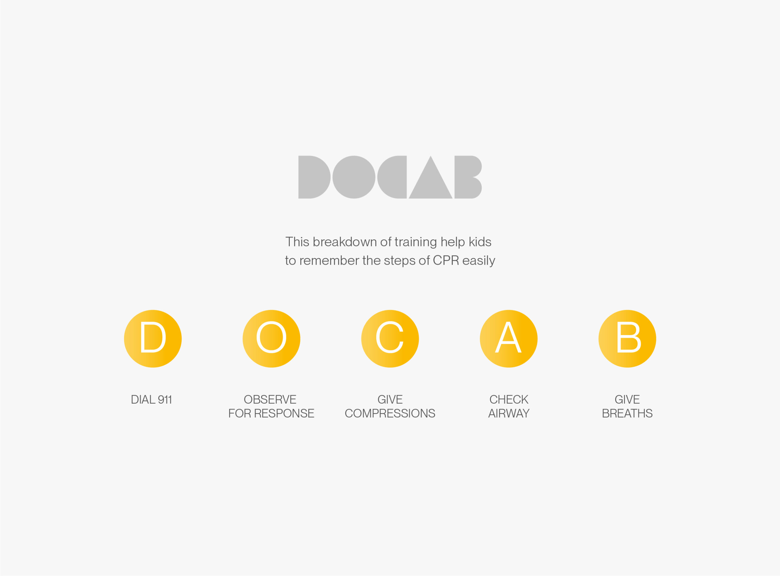
This mnemonic device aids in knowledge retention, providing a structure that is easily remembered by kids.
Training Design
CPRBuddy is designed to be an intelligent app that customizes the course based on each kid's performance, recognizing that not every child learns at the same pace. We divided the training into three phases: Tutorial, Practice, and Final. The child's performance determines the repetition or omission of these phases.
Learn in your own
Chidren often need a push to get started or need to feel that they’re being supported. While an involvement of the trainer being there as a support was an important thing, we found that children retain knowledge when they learn to do stuff by themselves.

Our process of designing the application involved multiple phases, each dedicated to a specific aspect of the user experience. We didn't just aim to develop an app; we aimed to create a comprehensive CPR training environment that could effectively teach and engage our young users.
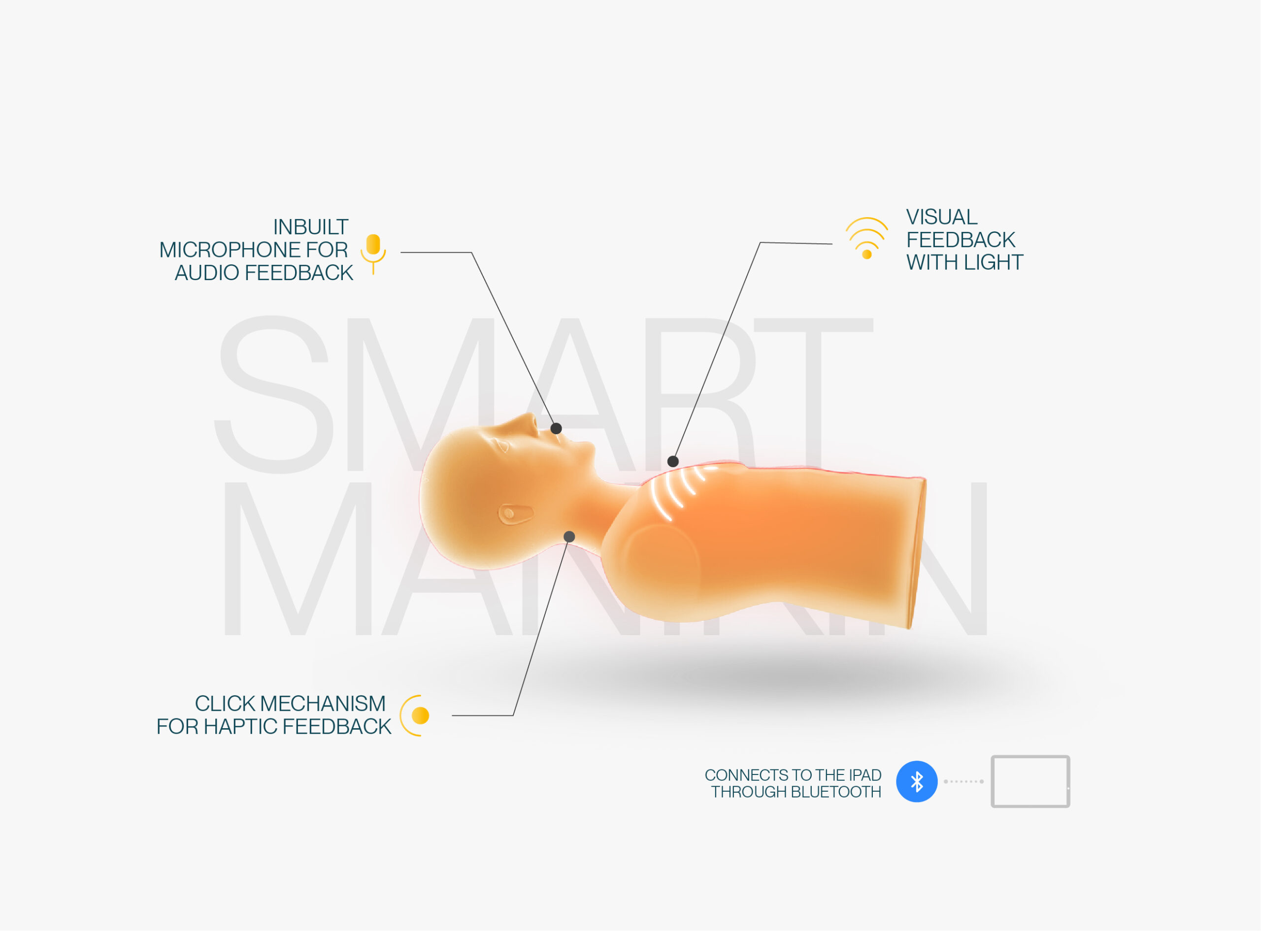
To add to the training's impact, we also looked at redesigning the manikin with several features such as visual feedback with lights on the chest area, haptic feedback with a click mechanism near the neck area, and audio feedback with an inbuilt speaker near the mouth.
We also introduced a 'buddy' character, Heartly, who acts as a guide throughout the CPR sessions, offering rewards and making the journey exciting for the kids.
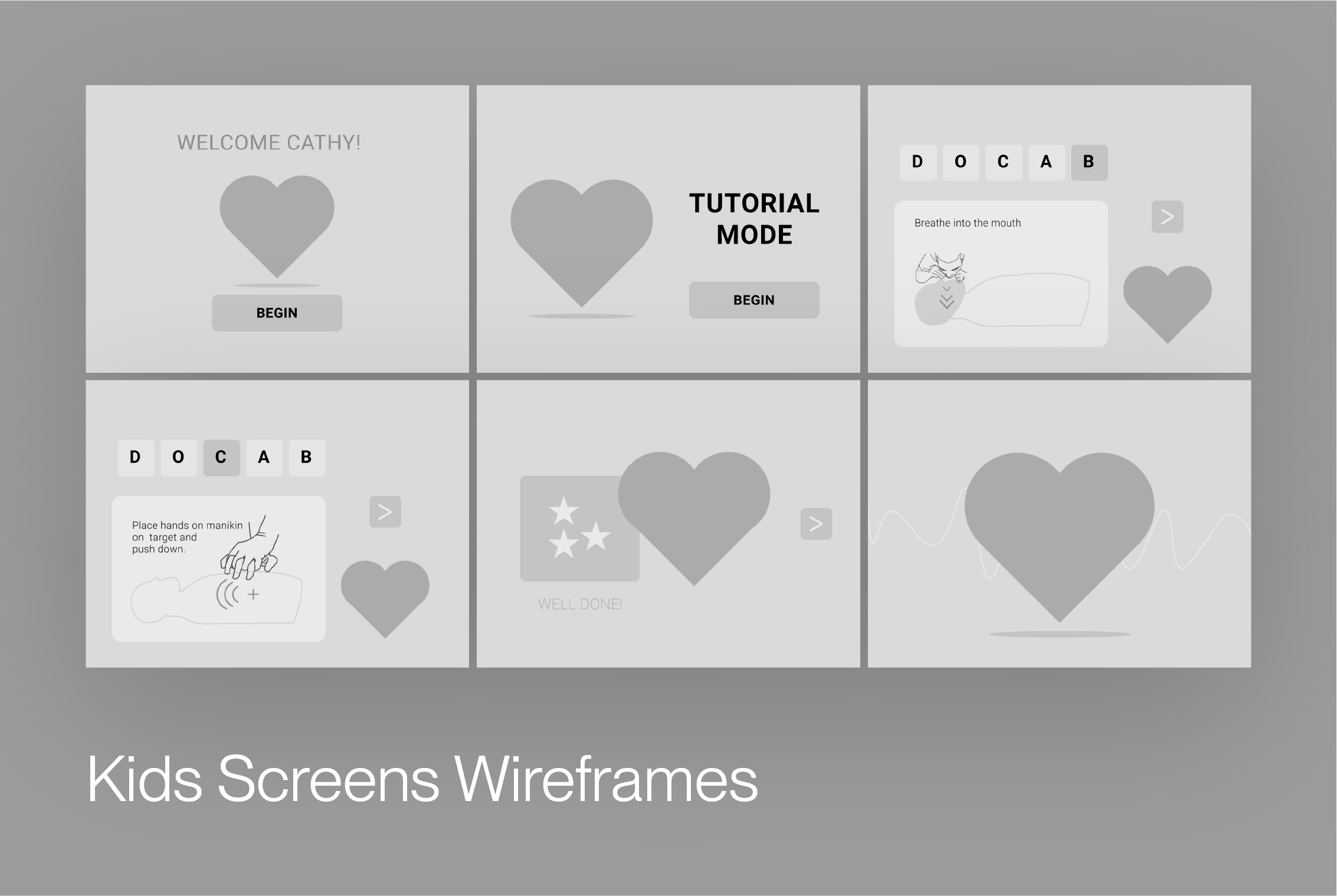



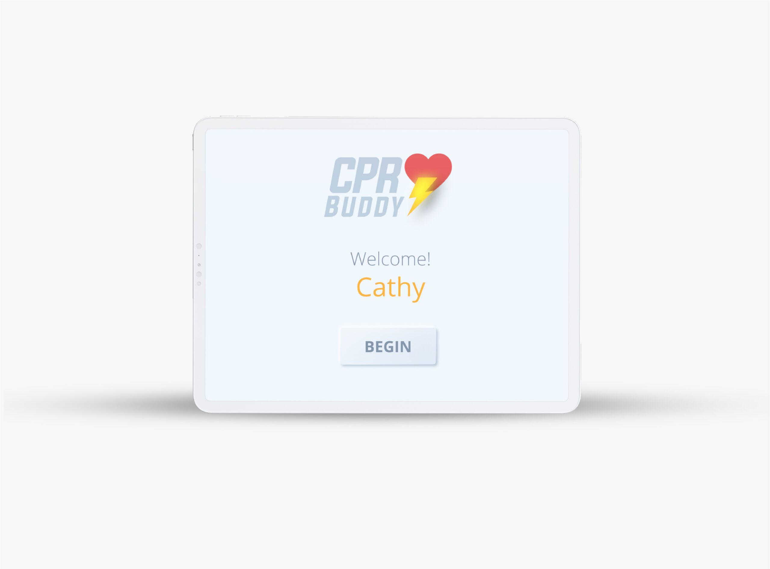
The version of app for the primary user, the kid.
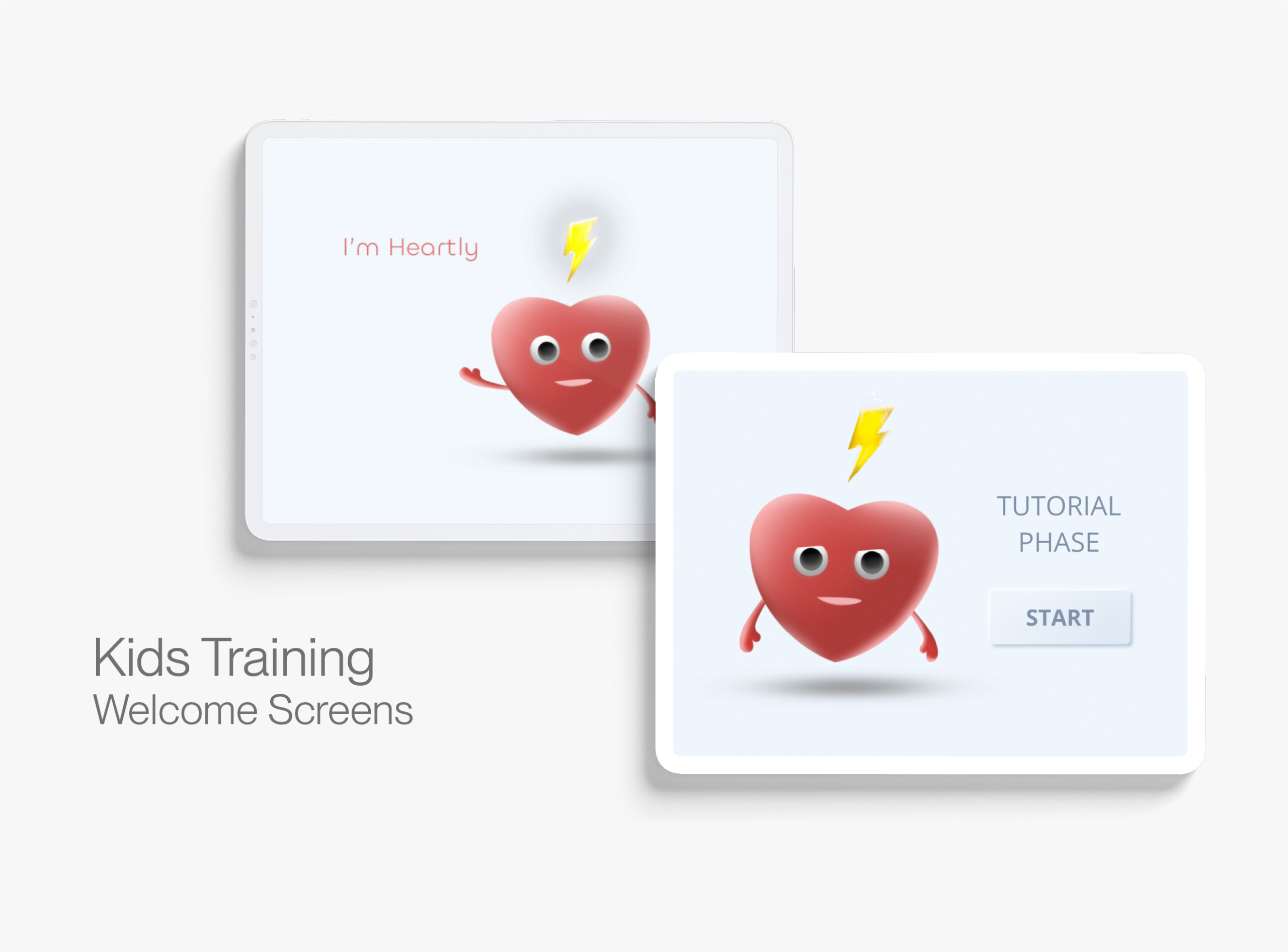
Welcome screens for the kids training section.
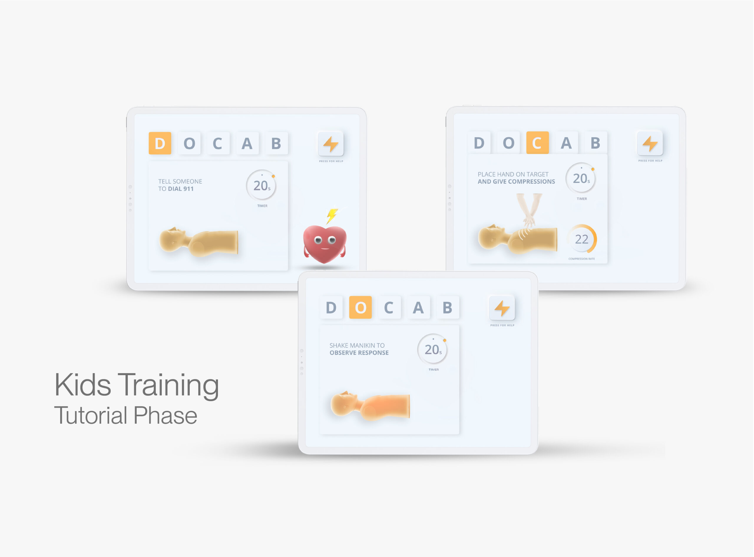
In this phase, the iPad is placed next to the manikin, and children get feedback about what they're doing on the iPad.
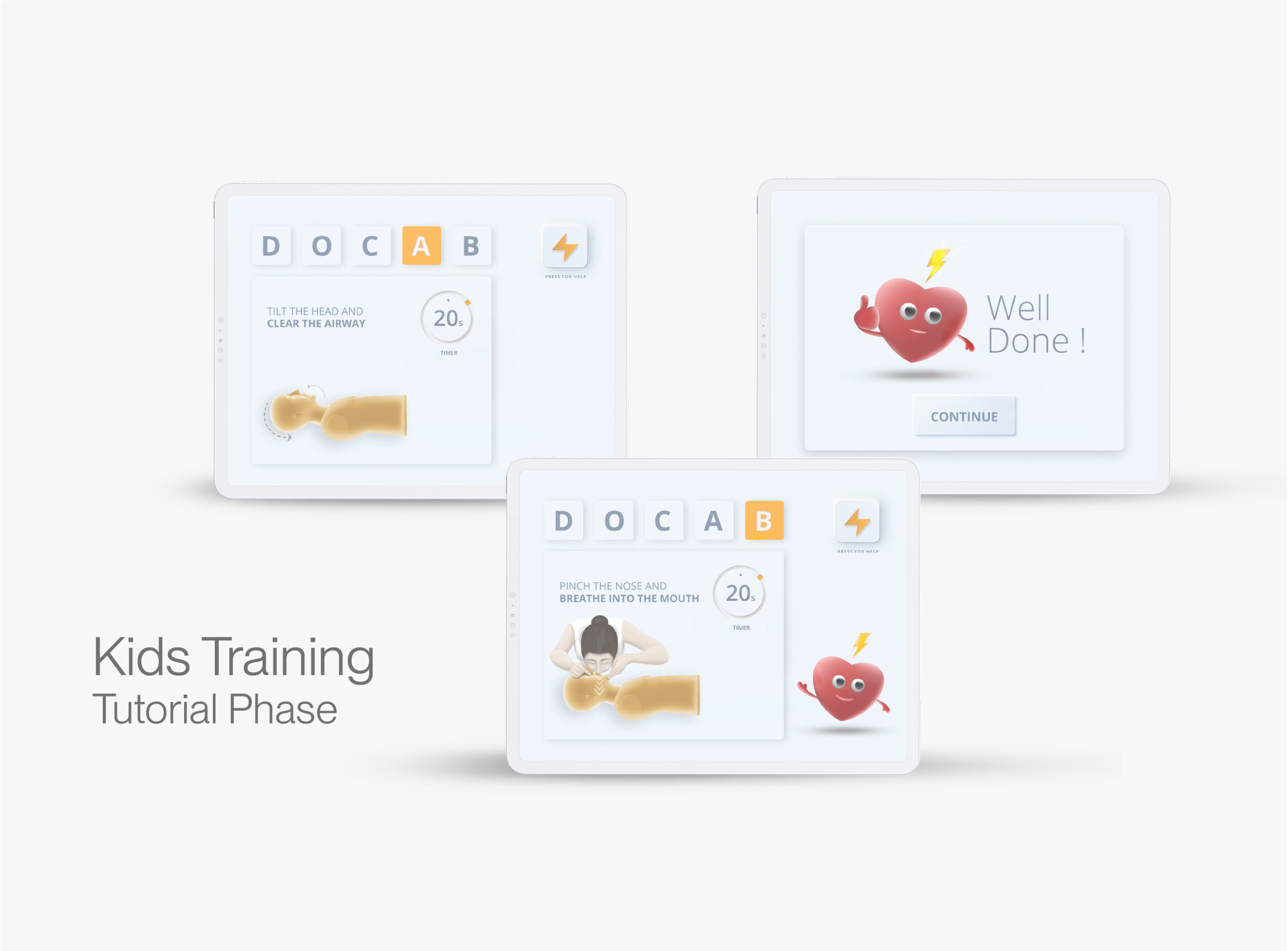
They perform the DOCAB routine and get familiarised with the manikin and its workings.
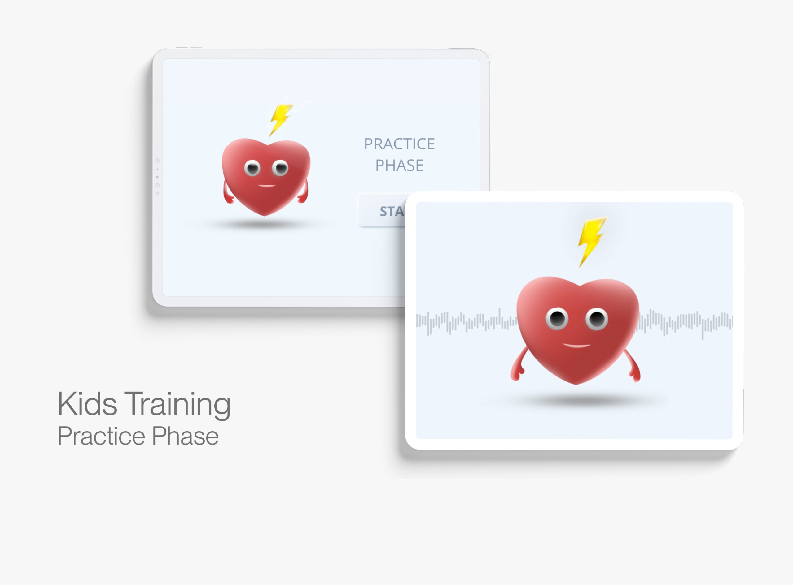
In this phase, audio guidance is provided when Heartly speaks to the kids and guides them through DOCAB. This design allows kids to concentrate on the manikin only and not get distracted by looking at the iPad screen.a
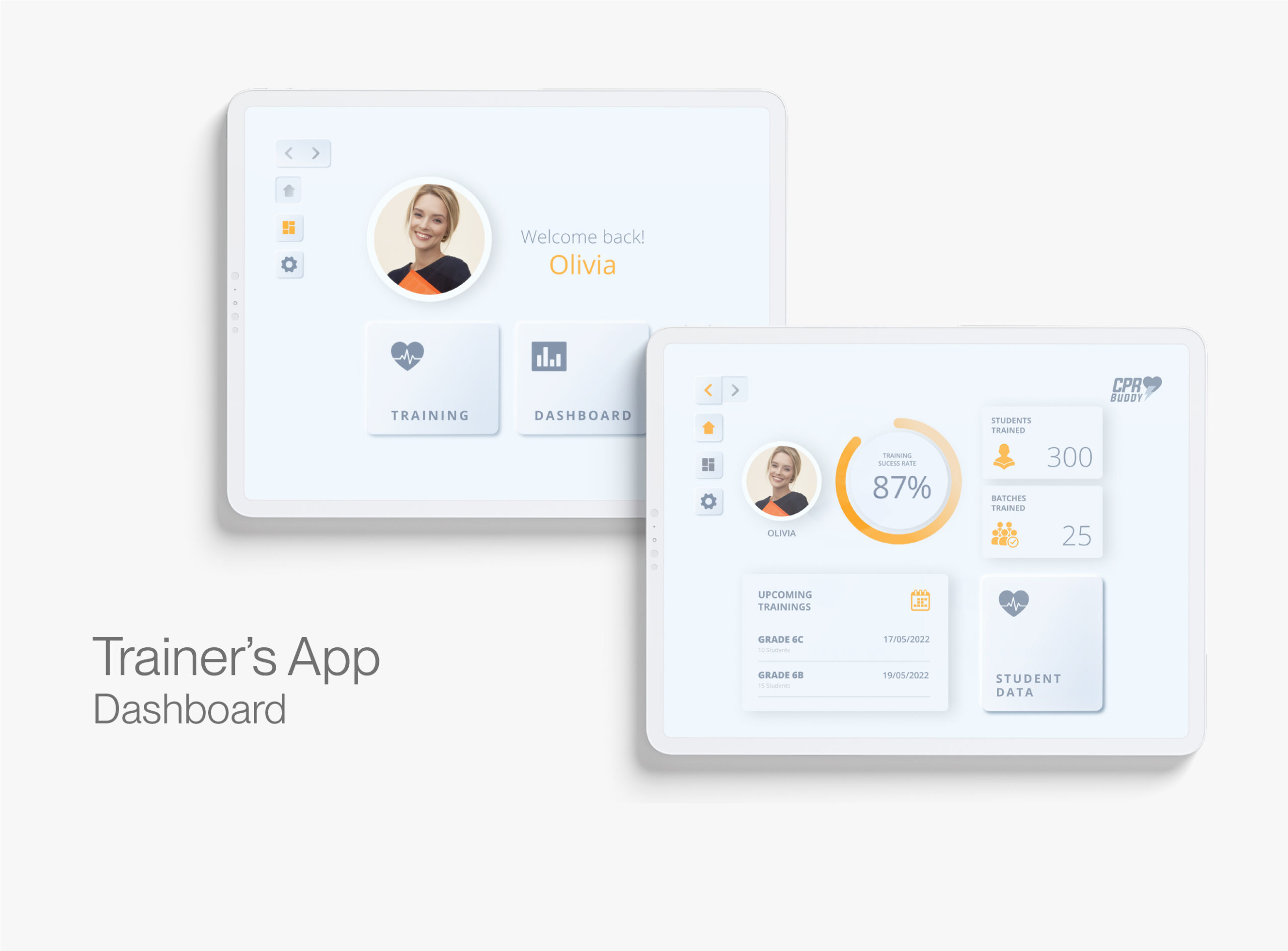
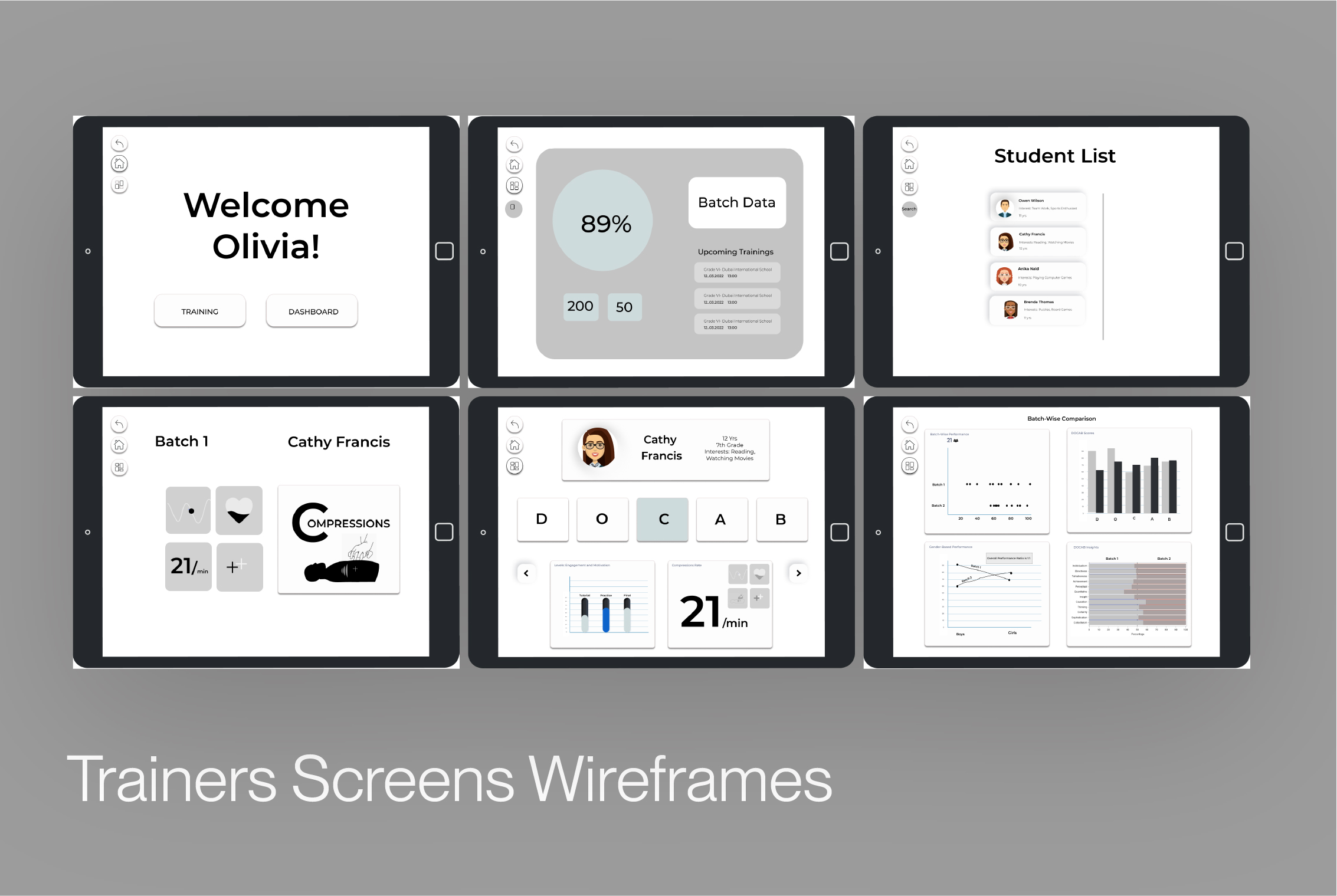
The dashboard gives insights into the trainer's achievements, upcoming training sessions, and other data.
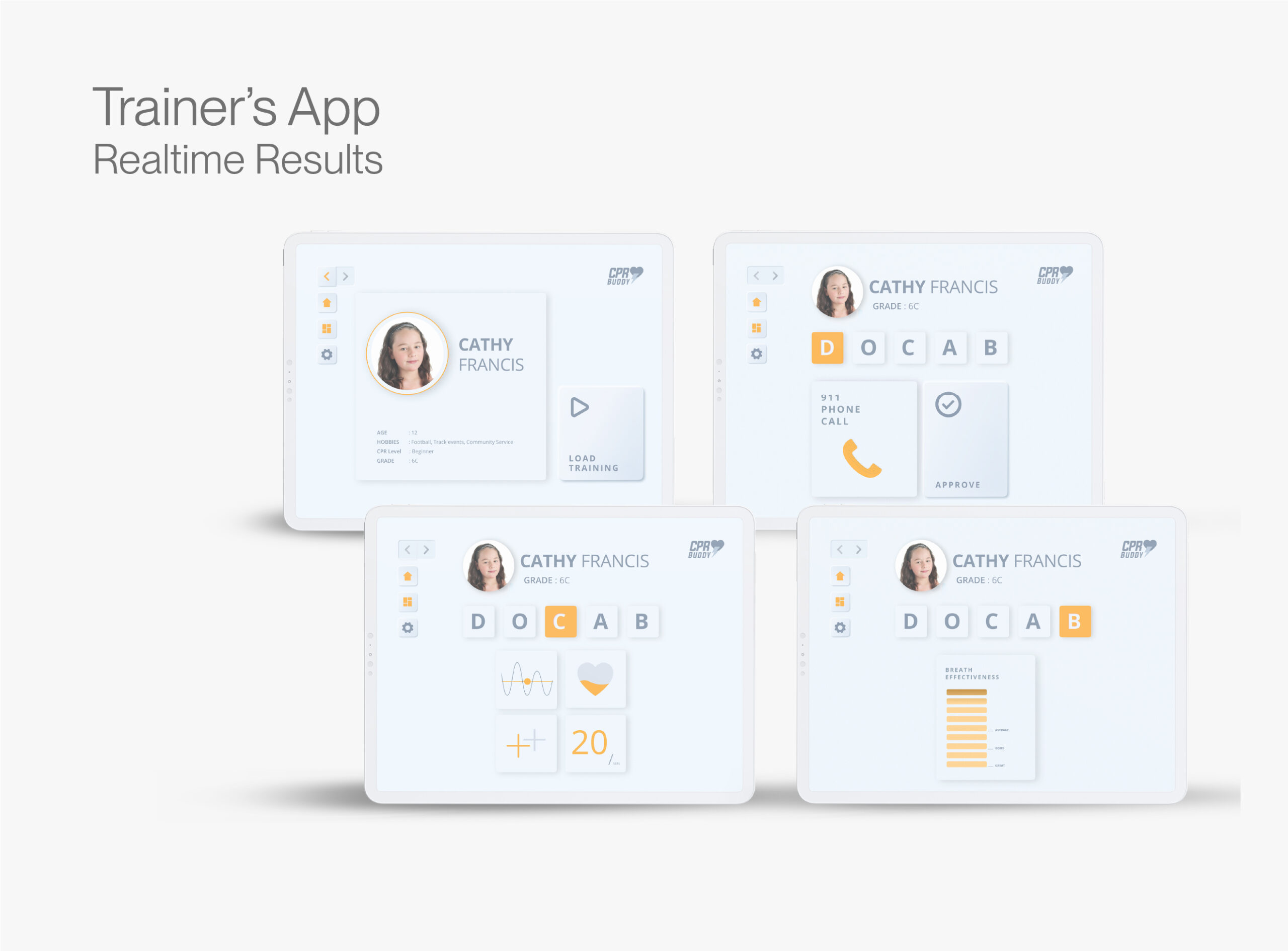
While the kid is training for CPR with the manikin and going through the training routine, the trainer can look into realtime performance insights.
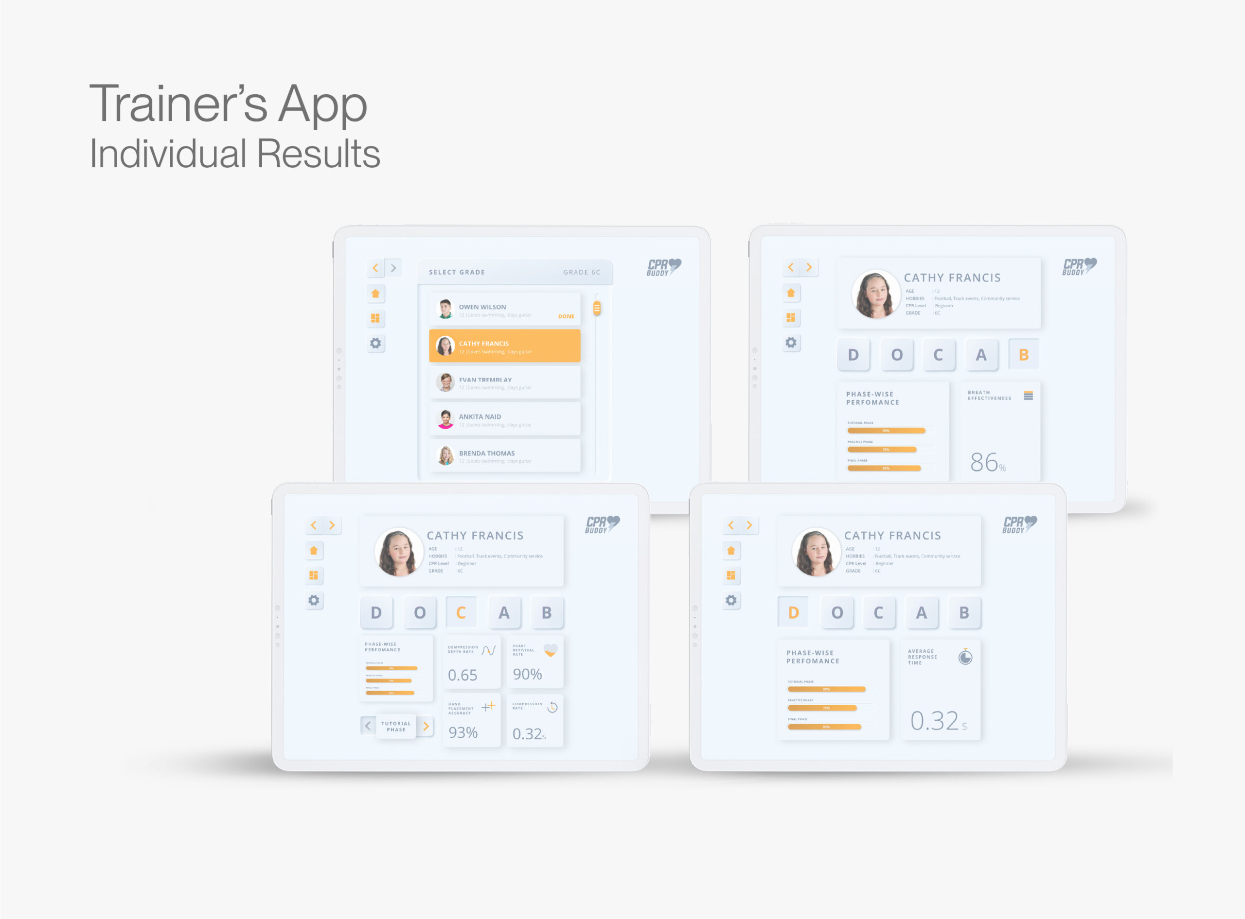
The trainer can check the training results of every kid from every batch they have trained. They can check the performance data for each section of DOCAB.
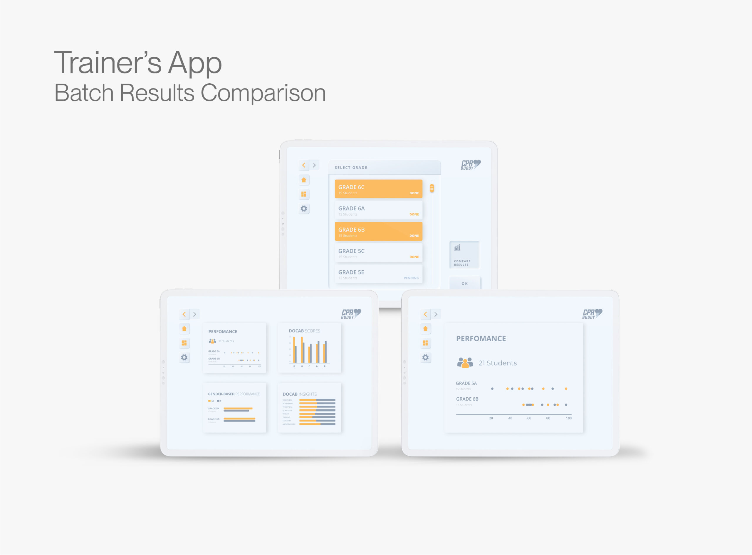
In this feature, the trainer can compare two batches they have trained to compare and evaluate their performance.
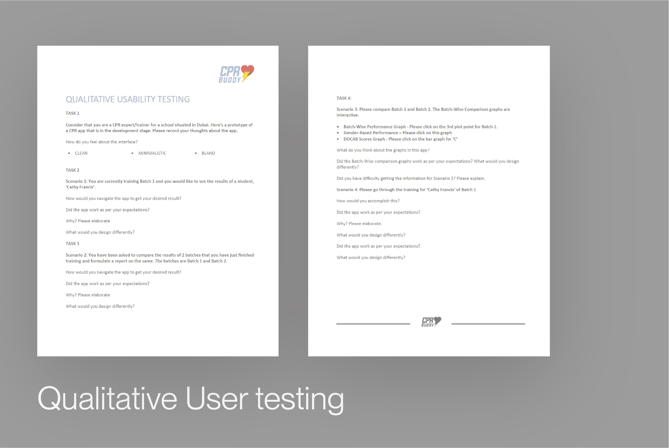
We conducted user testing following a participatory design approach. The participants were given a set of tasks with specific goals and asked to go through the prototype. For instance, "Compare the performances of student X in batch A and student Y in batch B.”. The results of this experiment gave us some interesting insights about our general workflow, navigation elements, and app design. This helped us critically review our prototype for functional aspects.
Insights and Learnings
-Positive affirmations and reward systems boost kids' confidence and intrinsic interest.
-We simplified the flow so kids could focus on CPR rather than the app.
-Minimal guidance and maximum independence increase knowledge retention, so the virtual bot was subtly guided.
-Kids learn faster when given space to explore and a step-by-step approach to training.
-Unique phase-wise data points about batch performance equip the trainer with salient information for future sessions.
Other Work

Brand Experience Design- SAPBrand & User Experience
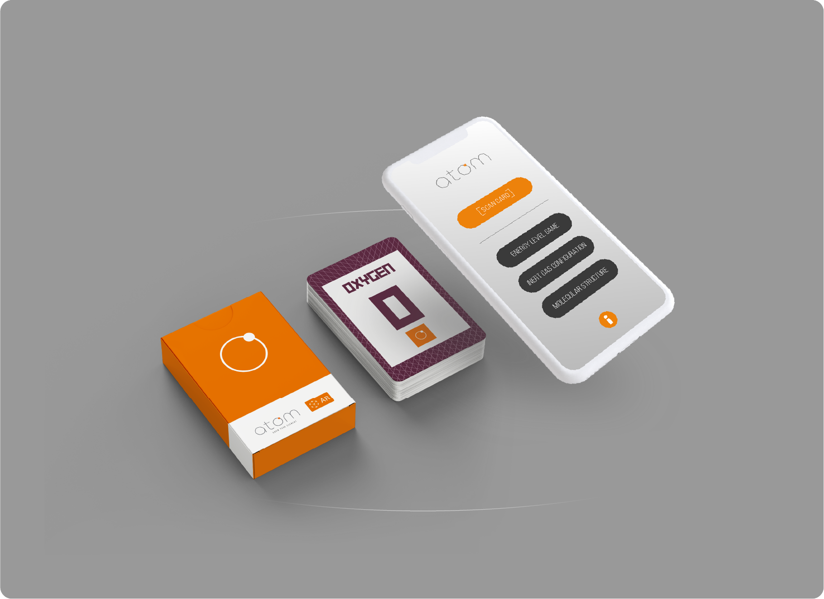
Atom - Know Your ElementProduct design & Development.
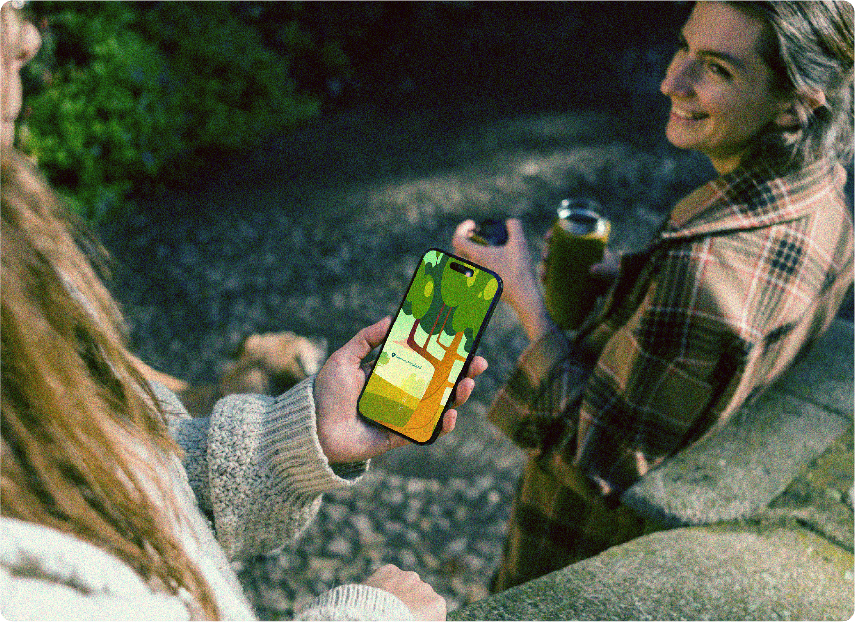
Look Around Mobile ApplicationProduct design & Gamification
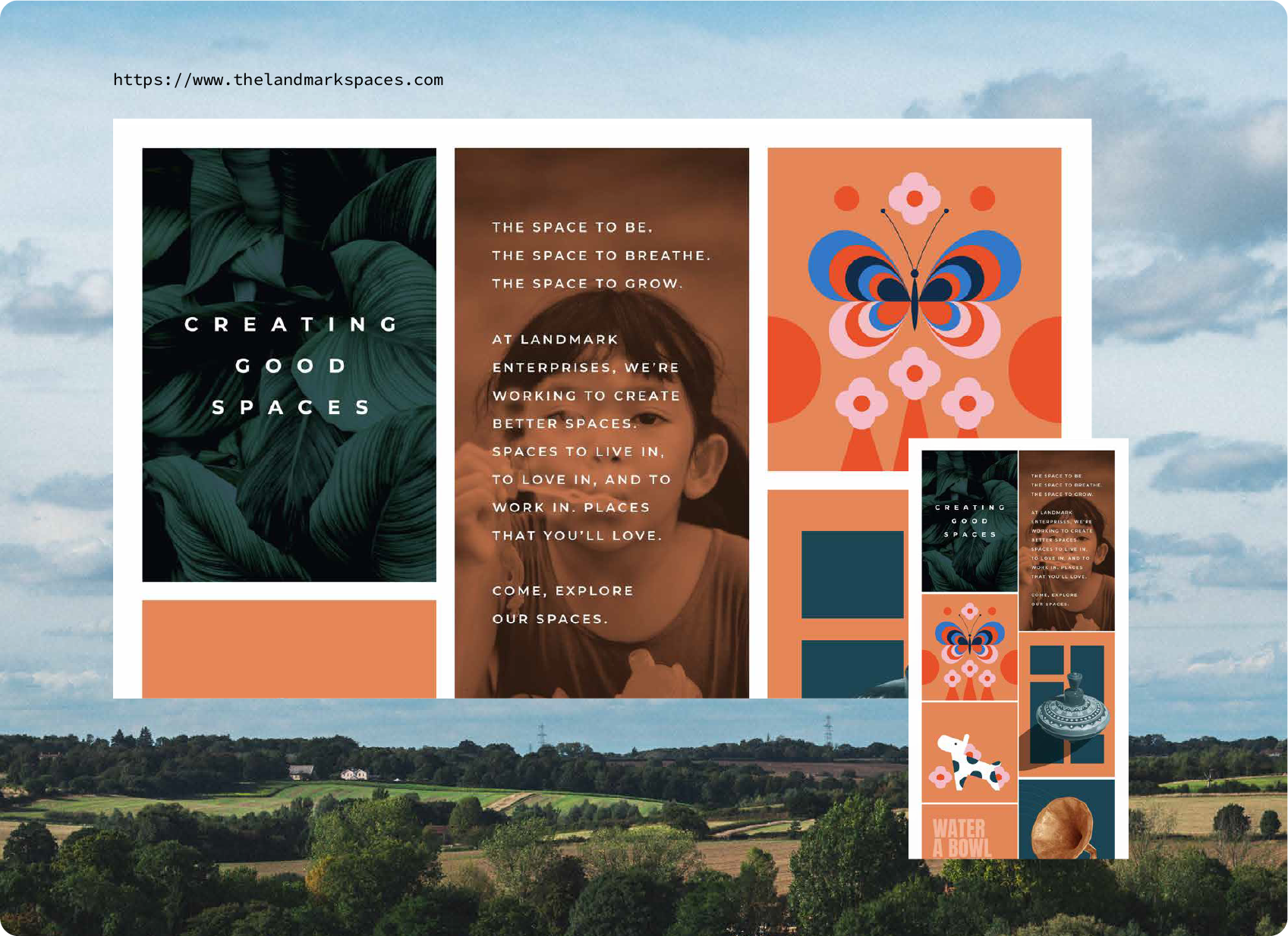
Landmark Brand DesignBrand Design
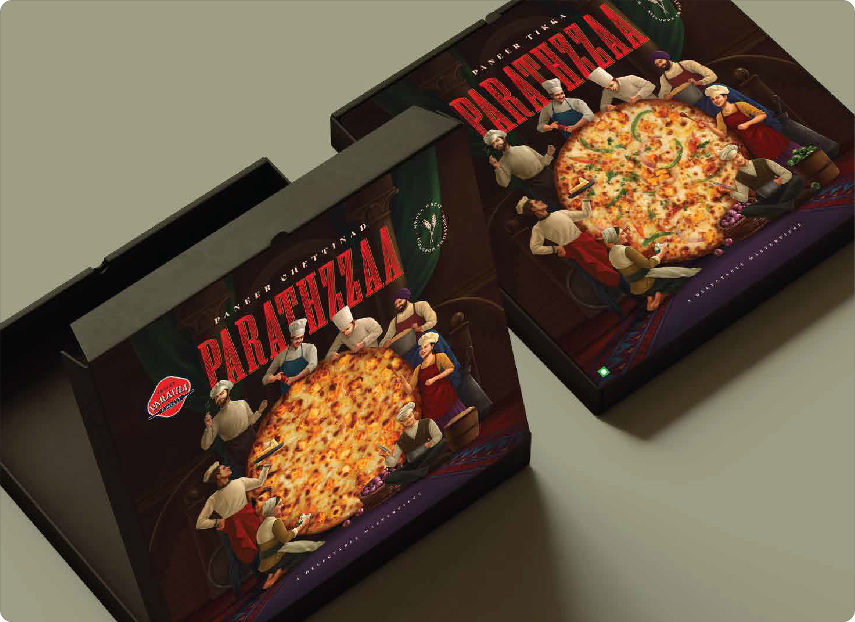
Parathzza - Brand & Packaging DesignBrand & Packaging Design
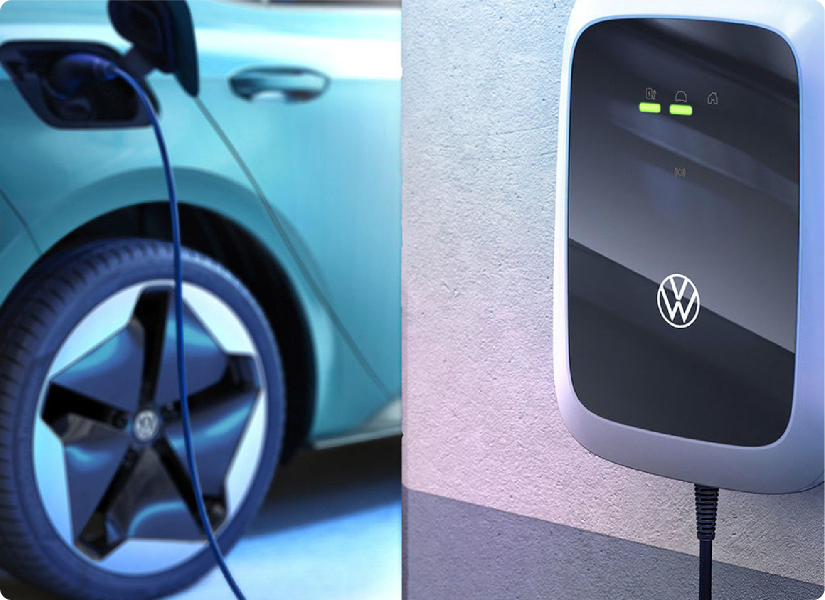
Improving UX for EV Charging- ElliUX/UI Design
MindTheDegreeProduct & Interaction Design
Skechers - GoLikeNeverBeforeArtDirection & Film

Ariel - The ImpossibleArtDirection & Film
LifeSync- MasterThesisProduct design & Development.
CPRBuddy for iPadApp & Product Design
Wondr - Interaction Design ConceptProduct & Interaction Design
